At Grammarly we are committed to helping our users communicate more effectively. Part of that effectiveness is helping them save time. Our team pays close attention to user feedback, and one feature in particular that Grammarly Premium users have expressed interest in is an easier way to apply our writing assistant’s suggestions. Developing this feature seemed like a clear chance for us to improve our product. Premium users tend to write more text than other users and also frequently copy and paste longer texts to get writing feedback. When they had a high volume of suggestions, they could only accept them one by one—and were spending too much time accepting each spelling or grammar mistake. This could be tedious and time-consuming.
We’re happy to say that Grammarly Premium users can now accept multiple suggestions at once in the Grammarly Editor.
It was an interesting road to get here. We went through several iterations of the design, and had to carefully consider trade-offs to arrive at a feature that balances convenience and control in the right ways. From the natural language processing (NLP) model to the front-end and backend, this feature was essentially bootstrapped from various side projects that ultimately fit together in a cohesive way. Though this feature presents a special case in which disparate pieces fell into place, in many ways this is also characteristic of our process at Grammarly—it’s an apt illustration of how we typically go from idea to launch and all the different teams that contribute along the way.
Defining the MVP
The problem was clear: Grammarly Premium users were spending too much time making clicks to accept high numbers of suggestions one by one. As we started asking ourselves what the minimum viable product (MVP) solution might look like, we could see that the simplest approach would be to just bundle all of Grammarly’s suggestions under one big Accept button. Would this solution solve the problem our Premium users were facing? Yes . . . and no.
As it turns out, there are certain suggestions that people tend to always accept, and others that are more likely to require further consideration, depending on the writer’s specific need. Grammarly’s confidence may be equally high across all of these suggestions, but user acceptance varies. Helpfully, there is a pattern that we can see when we look at the data. When the suggestions are about grammar, spelling, and punctuation—those rules of language concerning writing mechanics—they are accepted at a high rate. But Grammarly’s writing assistant goes much further than these areas to suggest improvements for clarity, structure, and tone, among other areas. Users accept these more “advanced” or “nuanced” suggestions less frequently.
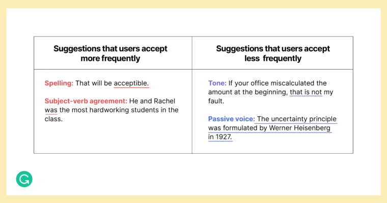
From a user perspective, accepting fewer suggestions for clarity, structure, and tone is quite understandable. One just has to look at the world of professional editing for an analogy. When a proofreader catches a typo, the writer almost always breathes a sigh of gratitude and never gives it another thought. But when an editor suggests rewriting a sentence to sound less aggressive, for instance, the writer may disagree: “I don’t think that sounds aggressive at all.” Grammarly offers these suggestions just as an expert writing coach would—but still recognizes that they’re inherently more subjective.
This finding had implications for the feature we were developing. If we framed it as “accept everything,” those who wanted us to adjust their spelling but not their tone might never give it a try. And we’d risk coming across like we believed in an overbearing, “one-size-fits-all” solution for writing, the complete opposite of what we value as a company. Instead, we framed the problem as “accept multiple suggestions that we are pretty confident you were going to accept anyway.”
Establishing metrics
When developing a new feature at Grammarly, after we define the problem (and before doing anything else) we establish the key metrics we’ll be tracking. Otherwise, we won’t have a way of knowing what success looks like. For accepting multiple suggestions at once, we selected metrics that could show engagement, repeat engagement, and quality:
- Appearance frequency: How often does the feature trigger for users?
- Activation: What percentage of users engage with the feature after seeing it?
- Subsequent use: Do users who have tried the feature one time continue to use it?
- Accuracy: Are we showing suggestions that users are likely to accept in bulk?
When testing any new model for a feature, we always analyze precision and recall. But it’s also important to find ways to get a measure of precision and recall on live data. Precision is the trickier of the two. For this feature, we decided to give people a way to revert suggestions (we’ll go into more detail on how we did this as we discuss the UX later on). And we then chose to look at how often users reverted suggestions to get a measure of how valuable they were finding this new functionality.
Developing a model
As the UX and engineering teams build the MVP for a feature, in parallel we almost always work with the machine learning (ML) and NLP teams to develop a model. Our assistive writing features are driven by complex models, whether they’re Transformer-based seq2seq models, neural nets, or others our team employs. In this case, the ML/NLP team had actually been working on a side project that we were all too happy to use to bootstrap our feature.
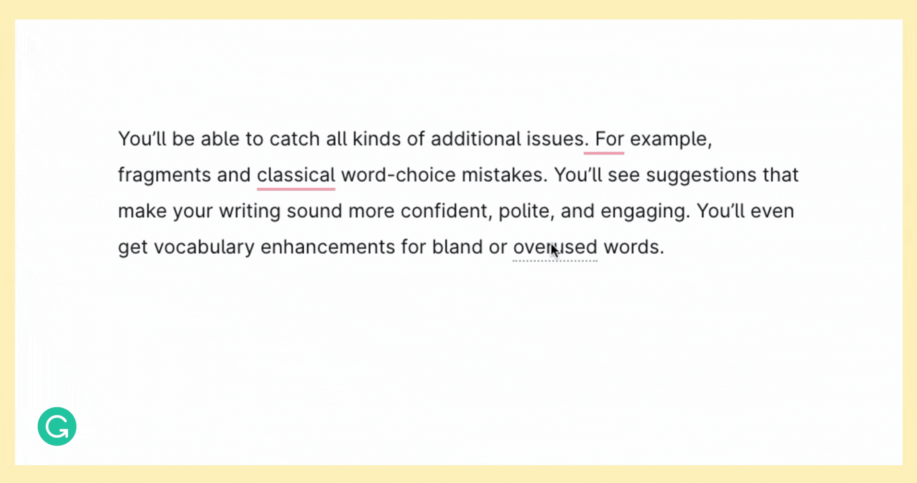
On a high level, the team had been exploring how to show more types of suggestions in the Grammarly browser extension. There our UX doesn’t have a side panel for showing suggestions, except in special integrations like Grammarly for Google Docs, so users primarily interact with Grammarly’s feedback through underlines in the text. We always underline grammatical, spelling, and punctuation mistakes, but we were thinking about ways to show feedback about clarity, as well, including conciseness suggestions. But because users were less likely to accept these suggestions, we weren’t sure when it made sense to show them. Our ML/NLP team had developed a model that would tell us whether we felt confident enough about a suggestion to cross that threshold and show it. This was such a good parallel to the feature requirements for what we were building that we were able to use it as a starting point and make tweaks later based on analysis, user feedback, and live performance of the feature.
We tuned the model to make sure that when we showed multiple suggestions to accept at once, we were hitting that balance of not being too aggressive while still providing time-saving value for users. Essentially this boiled down to adjusting the model’s threshold for showing a suggestion. Since different kinds of suggestions have different acceptance rates on average, we adjusted the threshold at the suggestion category level (grammatical error correction, clarity improvements, tone, etc.). Our North Star metric was 95% “user-generated” accuracy—which we defined as a suggestion that the user accepted in bulk (and did not revert, or “undo,” later).
Designing the user experience
When it came to the UX, first we had to decide when our feature would trigger. How many suggestions needed to meet our model’s threshold in order for us to provide the user with the option of accepting them all at once? Was two enough? We decided on three. (As the saying goes: two’s company, three’s a crowd.)
For the UX design, we initially prioritized a clean, simple visual experience. When our feature triggered, an Accept button would appear at the top of the suggestions feed. To call out the suggestions that would be accepted when the user clicked on the button, we added stars next to them in the feed. We later referred to this streamlined design as the “magic button” approach—because we had to build another approach when it became clear that our initial vision wasn’t quite resonating with users (more on that later).
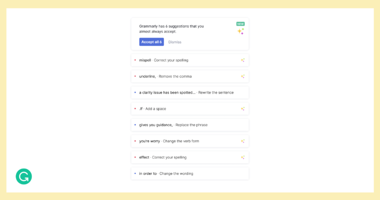
We also needed a way for people to change their mind after clicking on the button. They might realize that they didn’t want to accept a particular suggestion, or they might want to undo the entire operation. So we added an undo button and designed a way to revert individual corrections:
Building the feature
Discussing the full implementation could be the subject of another blog post in itself. But we couldn’t tell the story of how we built this feature without sharing some of the hurdles and victories for our front-end and back-end engineering teams.
This was one of the first features built using a brand-new internal library of front-end components that can be reused across any interface. (Our Microsoft add-in team used this library to bring Grammarly to Microsoft Word on Mac, which you can read about elsewhere on this blog!) We had a chance to test out the library and improve it. One of the challenges when implementing this feature was introducing a new type of “card” into the Grammarly suggestions feed. We needed to show multiple suggestions across disparate places in the text, but standard cards weren’t designed for this behavior. We refactored our components library quite a bit to make it possible to implement new card behaviors. As a result, there’s a new internal API for adding highly customizable cards into the suggestion list that can now be used across different product teams.
For the backend, a lot of the confidence scores were already in place thanks to the work by the Grammarly ML/NLP team, as mentioned earlier. We were able to repurpose some other work as well. Whenever we send an individual suggestion from the backend, the team has built a way to fetch surrounding words or characters that might be helpful to provide context to the user. This API proved especially important for our UX. If people had to search through their text to get the key context for Grammarly’s suggestions, we would be defeating the time-saving purpose of our feature.
A/B testing and rollout (and rollbacks!)
As usual with a new feature, we ran user testing with our “magic button” design and released our MVP to Grammarly employees. That’s where we started to see the first signs of problems with the UX. We thought people would understand which suggestions would be accepted based on the stars in the feed—but our design hypothesis was wrong. They hardly noticed the stars. And often people didn’t realize they’d be able to revert the grouped suggestions, either. In summary, they weren’t sure what would happen, or if it would be permanent—so they were naturally a bit wary of clicking on the magic button.
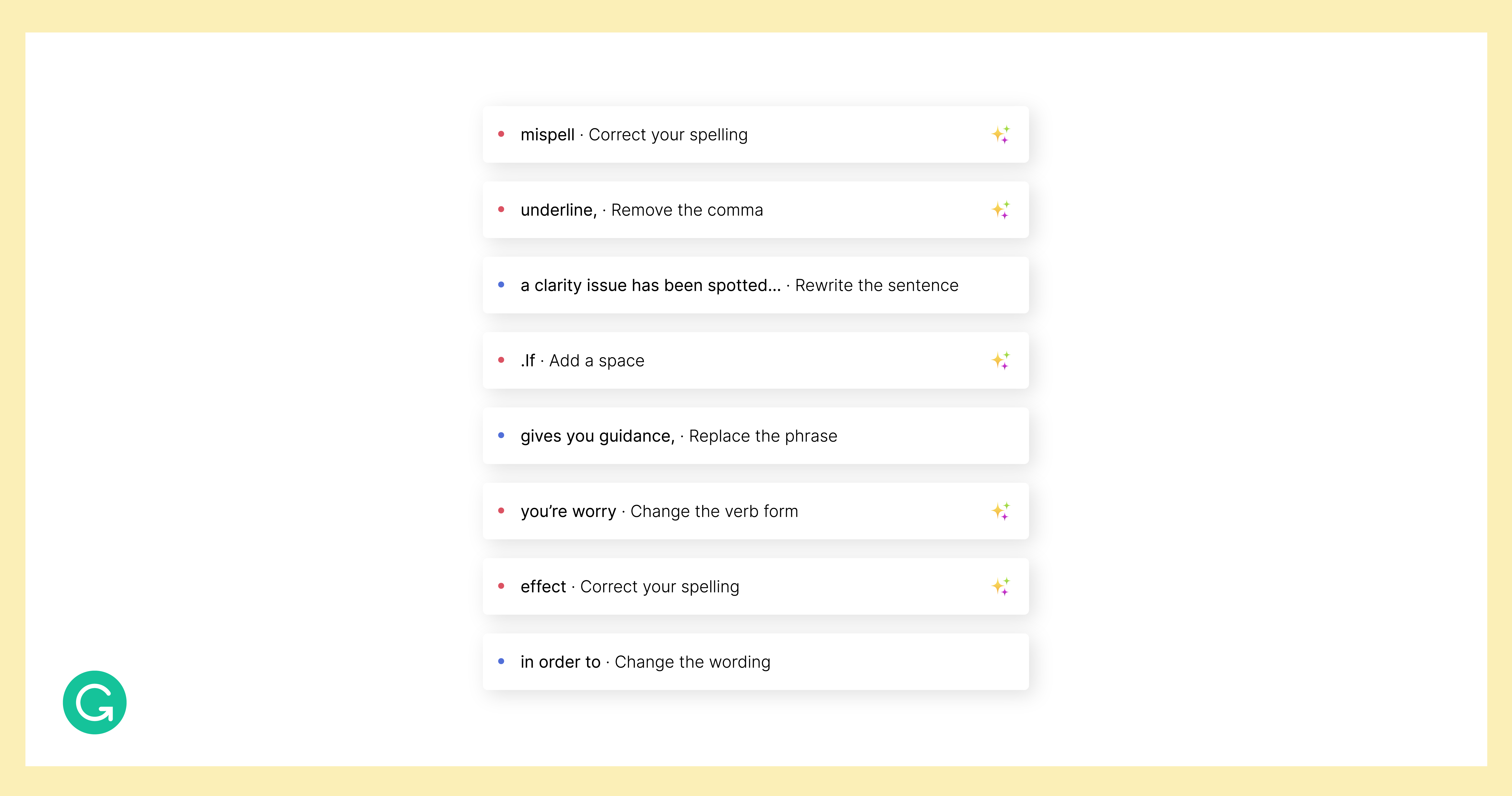
Can you spot the stars? Many internal users didn’t notice them.
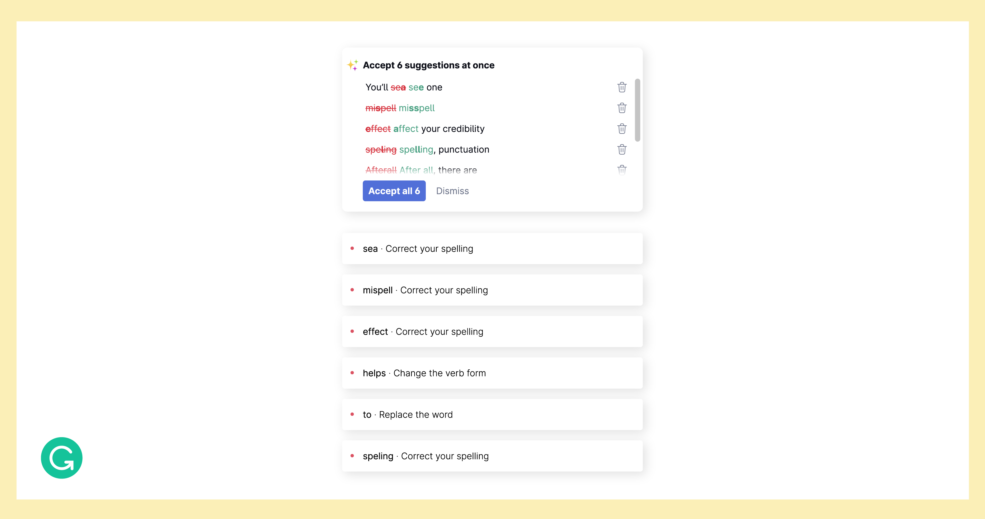
Even though at this point we knew we’d have to change the UX, we still decided to release the initial version of our MVP to 5 percent and then 10 percent of our Grammarly Premium users. This way, we could collect baseline metrics against which to judge our subsequent efforts. While we were releasing the feature and collecting data, we quickly designed and built a new version of the UX to A/B test against the original magic button design. (For this, we randomly selected 10 percent of Premium users who hadn’t yet seen the feature.)
Our new UX was less minimal, clearly showing which suggestions would be accepted using a preview panel.
When we compared the numbers, activation was over 10 percent better with our new design. We rolled out the feature to all users with our improved UX—but, as the launch gods would have it, we weren’t out of the woods yet.
As we were shipping out a minor improvement right after launch, we broke alignment in the cursor. In cases where someone was typing along and made, say, some spelling mistakes that triggered our feature, the panel with the accept button would appear, forcing the user’s cursor to jump to the top of the page. As soon as we discovered the issue, we were able to roll back the release and fix this annoying bug right away. Realistically, a launch is never completely smooth—so we are always vigilant about listening to our user feedback channels (shoutout to those who report issues with our product!).
Next steps
Now that this feature has been in production for about six weeks, we are starting to see some really interesting data come in. Some of it validates our product decisions, indicating that we are helping users save time when they write. We’ve found:
- The average number of suggestions that users accept is around ten.
- Activation (the number of times users click on the feature / the number of times it’s shown) is around 44%.
- Subsequent use is 54%.
- Accuracy is approximately 98%.
We’ve made the first step in taking this feature from 0 to 1, and while we’re happy with the results so far, we’re seeing data indicating directions we’d like to explore further:
- When users only see three suggestions, the acceptance rate is only around 13%. We need to examine the “low suggestion” cases more closely.
- Appearance frequency is 43%. We’d like to explore ways that we can have this feature trigger more often, without compromising on quality.
- There are some suggestions that users tend to ignore when they are included in our feature, even though our model has high confidence that these suggestions are usually accepted in general. We may need to find ways to filter out suggestions like these.
In order to provide this time-saving feature more often, we want to start testing more types of suggestions that can be accepted all at once. Right now we are working with fairly broad categories, but there may be some special cases within these where we can get more granular and adjust our model’s confidence thresholds accordingly.
A natural step will be building more personalized models to address individual users’ preferences. For example, one person may always accept suggestions to use the Oxford (or serial) comma (a style choice on which people tend to be divided). For this user, we can confidently “promote” these suggestions to be “suggestions that you almost always accept.”
As of today, this feature is available to all Grammarly Premium users in the Grammarly Editor. Now we’re working on shipping it to other interfaces, such as Google Docs and in the Grammarly browser extension. Meanwhile, with experimentation and iterations, we’re continuing to improve the feature and gain insights that will help us take the right next steps. Our end goal remains the same: Reduce unnecessary tedious work so that users can focus on improving their writing and communicate as they intend. Whenever they write, we want our writing assistant to be there to help.
If you are passionate about improving human communication for millions of users and love building 0-to-1 products, Grammarly is hiring! You can check out our open roles on the Product and Engineering teams here.